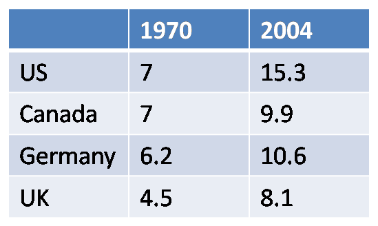
The U.S. has seen the most dramatic increase by far. All of the other nations listed have some form of comprehensive national health care coverage. It's not just that our health care outcomes rank behind most of the western world. It's not just that we spend twice as much per patient as the rest of the industrialized world. It's also the fact that overall health care costs are careening out of control at a rate that far surpasses everyone else in the world.
All of the empirical data points to the fact that our health care system is medically deficient and economically inefficient. Never mind, the fact that we have 45 million citizens with no coverage whatsoever. It's insane that we continue to have any debate whatsoever about whether or not we should move to a system of comprehensive coverage.
I found this chart over at Paul Krugman's blog where he discusses health care costs in relation to our spending on "entitlement" programs. Give it a read.
No comments:
Post a Comment